

THE
ORKNEY DISTILLERY
Crafting a distinctive label for an ambitious distillery nestled in the heart of Kirkwall.
From fine gin to rich whisky, these innovative pioneers boldly steered their vessel into the adventurous world of rum, presenting us with the exciting opportunity to design a swashbuckling label that pays tribute to a cherished Orkney landmark.
SERVICES
Product Packaging
YEAR
2025

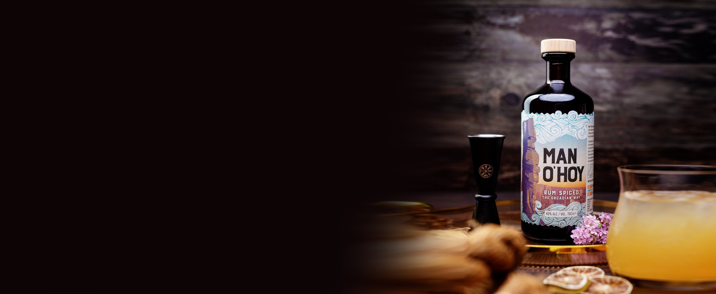
MAN O’ HOY RUM SPICED THE ORCADIAN WAY
ODE TO THE OLD MAN
The Old Man of Hoy Sea Stack stands prominently front and centre on this rum label. The towering sea stack itself occupies a significant portion of the central area, drawing immediate attention. Flanking it on both the left and right sides is a wealth of detailed information and fascinating facts about the monolithic formation, enriching the label with context and history.
orkney blast
The left portion draws inspiration from an old Orcadian newspaper known as “The Orkney Blast.” This section presents a thoughtfully modernised variation of the newspaper’s original layout, creatively showcasing intriguing fun facts alongside a deeper and more detailed exploration into the rich history and cultural significance of the sea stack.
COHESIVE BRANDING
The Orkney Distillery applies its original wave decal consistently across its entire range of spirits, including both its gin and whisky varieties. For this new design, we reimagined the waves in a fresh and innovative way, presenting them as clouds hovering above and waves rolling gently below. While the label stands apart from their usual designs, it still harmonizes well within the overall spirit collection, maintaining a cohesive yet distinctive presence.
SPECIAL FINISHES
On the physical label, the title font and the sea stack are carefully embossed to imitate the tactile sensation of rough rock when running your fingers along the surface. This texture is deliberately more rugged and less smooth compared to other labels, creating an authentic rustic yet classy appearance that evokes a natural, handcrafted quality.
A key influence behind the Man O’Hoy Spiced Orkney Rum label design was the historic Orcadian newspaper The Orkney Blast, whose bold typography, weathered print textures and characterful editorial style informed the overall visual direction. I incorporated elements reminiscent of vintage newspaper layouts and traditional print ephemera to give the label a sense of history, storytelling and local identity, while reinterpreting them within a modern premium packaging aesthetic. The intention was to evoke the feeling of a rediscovered maritime broadside — something rooted in Orkney’s coastal culture and seafaring heritage — while maintaining clarity, sophistication and strong shelf presence for a contemporary spirits market.

Photos courtesy of
The Orkney Distillery
We created a visual identity that reflects both the rugged character of Orkney and the warmth of the rum itself. The design draws inspiration from the dramatic coastline and the iconic Old Man of Hoy sea stack, balancing maritime heritage with a contemporary premium spirits aesthetic. Through considered typography, colour palette, illustration and layout, the label was developed to stand out on shelf while communicating authenticity, craftsmanship and a strong sense of place.
The project involved translating the distillery’s Orcadian storytelling into a cohesive packaging design that felt distinctive, atmospheric and commercially polished across both print production and brand presentation.
