

EVIEDALE
BAKEHOUSE
Designing a whole new brand packaging line for Eviedale Bakehouse’s Sourdough Beremeal crackers. Orkney’s dedicated Sourdough bakery with the first wood-fired pizza oven in Orkney.
SERVICES
PRODUCT PACKAGING PRODUCT PHOTOGRAPHY BRAND DEVELOPMENT
YEAR
2025/2026
THE PRODUCT
THE PRODUCT
beremeal.
sourdough.
crackers.
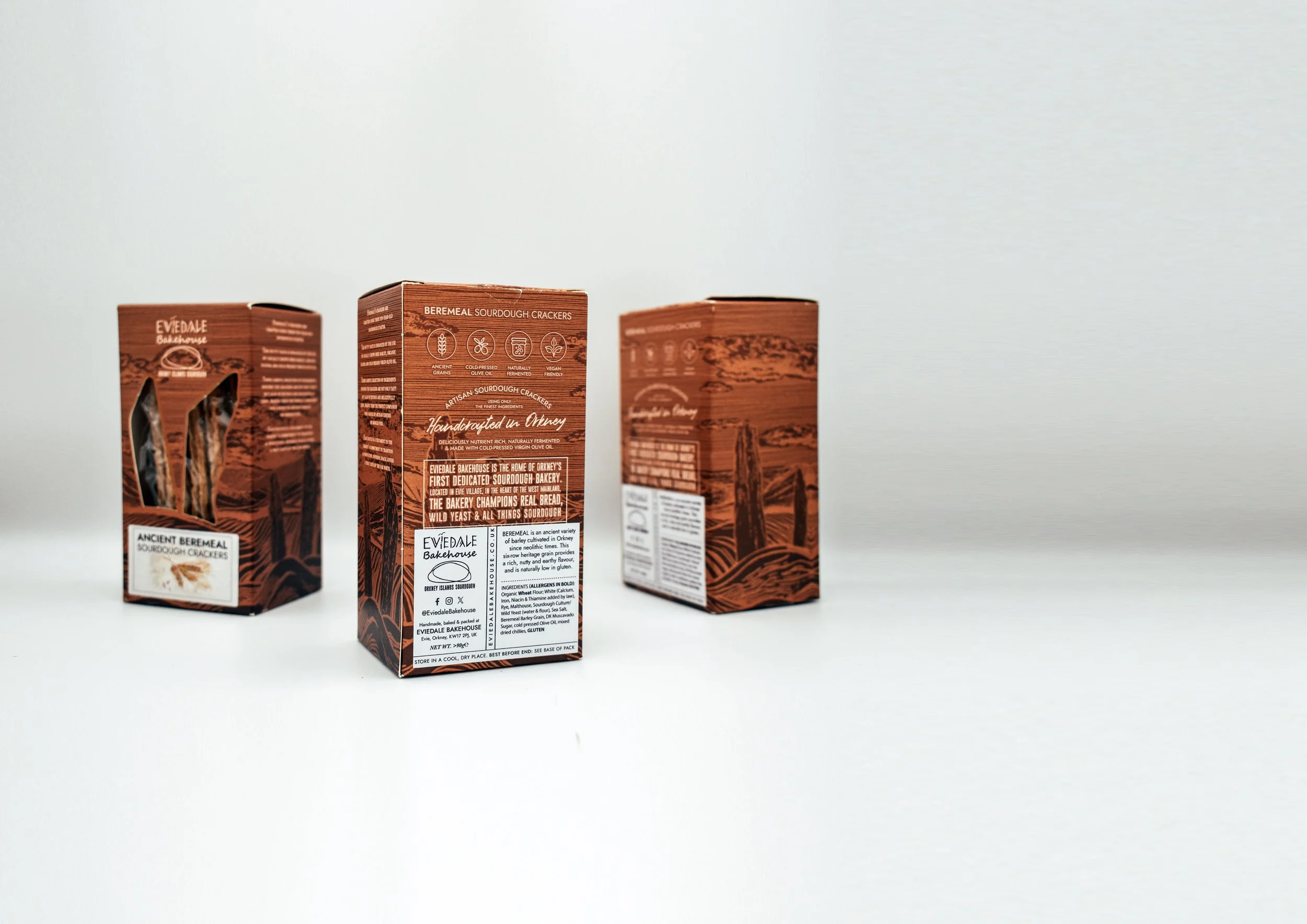
Eviedale Bakehouse have now developed a new product, exploring the use of the locally grown ancient grain, Bere Barley. This neolithic heritage grain is exclusively milled at The Barony Mill, the last working watermill in Orkney, using traditional methods handed down through generations. It remains the only mill in the world still regularly milling Bere barley, preserving both a rare flavour and an important part of Orkney’s agricultural history.

PRODUCT PACKAGE DESIGN
PRODUCT PACKAGE DESIGN
NEOLITHIC
INSPIRED
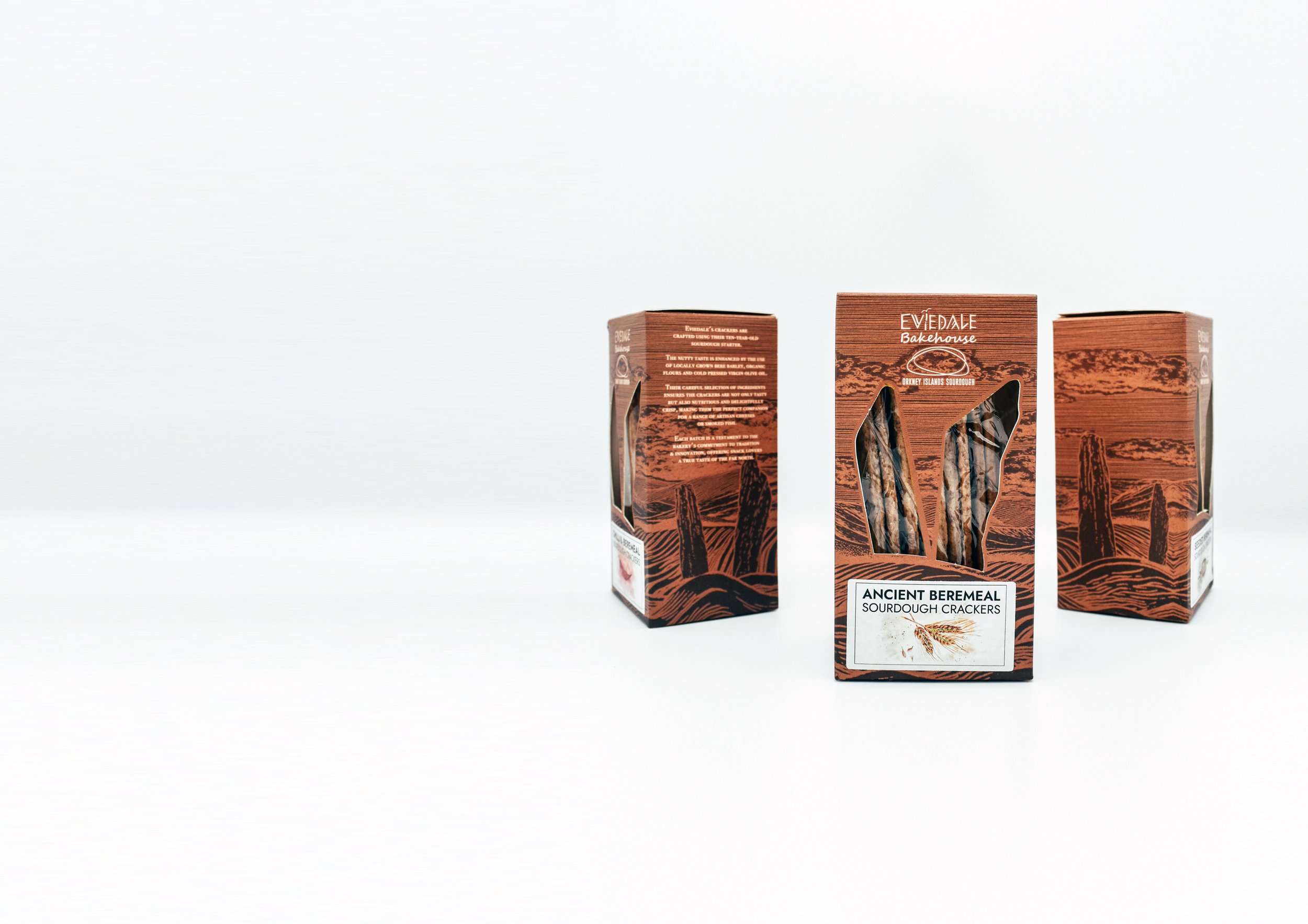
The artwork was inspired by the Rings of Brodgar, a 5,000‑year‑old standing stones monument that is widely renowned. A distinctive landmark of Orkney, it gave the packaging a grounded and historic feel. The rustic, earthy brown tones and the woodcut-style illustration impart a primitive, tactile quality while retaining a clear modern sensibility.
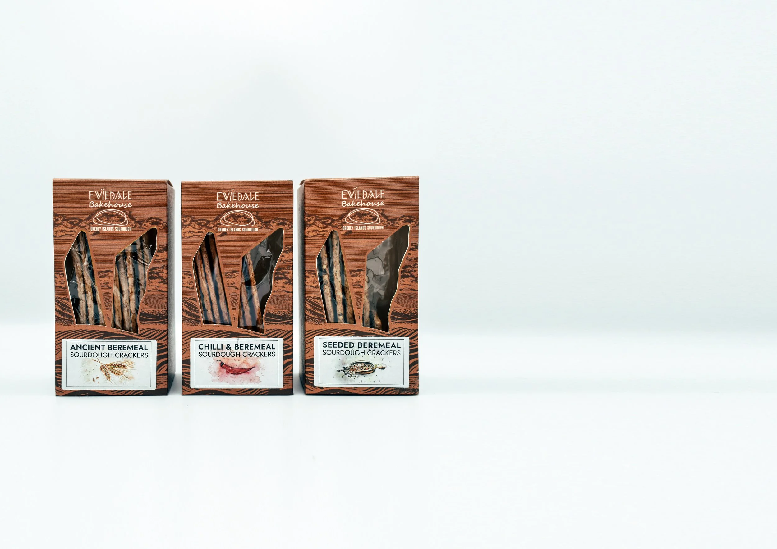
To add a splash of colour, we decided to go with individually placed flavour labels, each one depicting the flavour in fun yet classy watercolour art.
NOT YOUR TYPICAL
CRACKER BOX
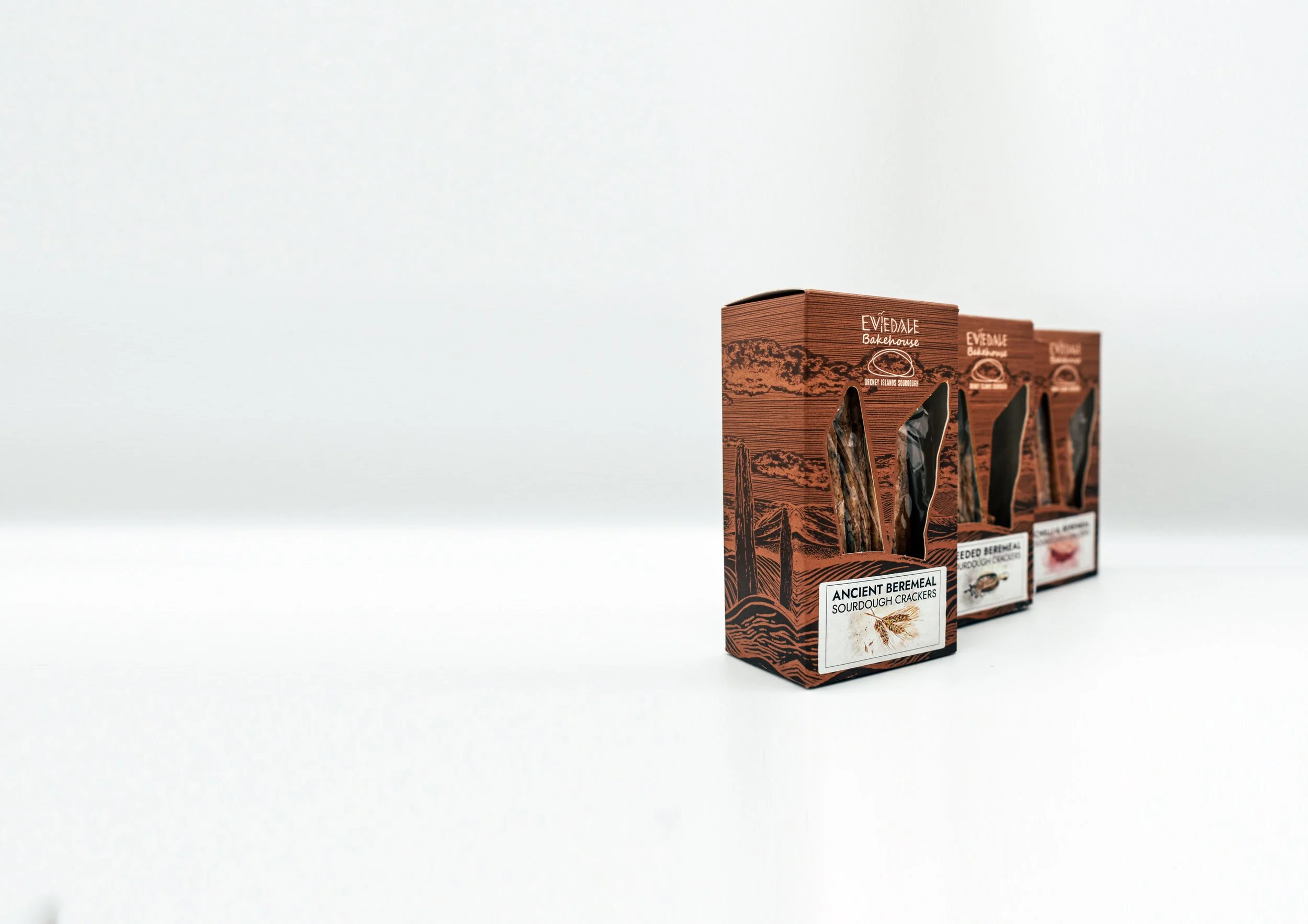
The illustration extends across the full surface of the box, creating a cohesive, continuous landscape that unifies the entire scene.
It’s common practice for biscuits or crackers to feature a die-cut window in the box so consumers can see the look and texture of the product. For this box, we chose to incorporate two iconic stones from the Rings of Brodgar, subtly framing the view. This approach blends local heritage and Orkney history with the practical considerations of packaging and handling.
handcrafted
in orkney
For the back of the box, we leaned on clear visual icons and a deliberate throwback to traditional typographic styles. Mixing that modern sensibility with retro touches gives us a refined, considered look that communicates a respect for the past while expressing confidence in moving forward and embracing innovation. The result feels fun, vibrant, exciting and visually pleasing.
The label is a temporary placeholder because of the default box design and the range of flavours. A revised concept will introduce distinct, standalone boxes for each flavour, removing the requirement for labels altogether.
PRODUCT PHOTOGRAPHY
PRODUCT PHOTOGRAPHY


